St James Theater Design Project

Color within the city

The first studio lesson of the year required us to take a closer look at the city environment around us in relation to color. While taking a walk down to St. James Theater (the place of our first semester project) I found myself asking myself a series of questions about color in the city. Where is color usually found in the city? Does it effect the area around it? and if so, how? How do people react to color in a city environment? I took the photos above to try help myself answer these questions and look further into the ideas of color (or the lack of color in some cases) in this urban space. I these turned these into quick color collages (pictured below) so I could focus on the colors alone and outside of the city context.

These color collages were then translated into abstract models. The first model (pictured below) was based off of the ideas such as color, light, and shadow. When making this model I began by making a structure that curved and pointed out in strange ways in order to create shadows underneath it and in between the different sections that stick out of it. I then added some red shapes to help with these ideas of shadows and also add color to the model which stands out against the white.

The second model (pictured below) was based off of ideas such as surface, texture, and shadow. In this model I played around with how I could bend and crease the paper to try and give some sharp edges but still have a smooth texture (just like the buildings I saw around the city). I also tried to fold, twist, and curl the blue paper to represent the idea of the sky and the wind that blew through the streets between the buildings. These shapes then cast light shadows onto the rest of the model which I found interesting.

The third model (pictured below) which had a purpose of trying to connect the previous two models together. In order to make them flow nicely into each other I took features from each of the two models I had made already and combined them to make a “mash up model”. I did use a different color to help this connecting model stand out a little bit, but it still works with the ideas and shapes that I had already used.

Model Making and Seminar Planning

At the start of week 2 in studio we were presented with a small group project to write a 10 minute seminar about one topic of the 10 provided. The group I was in decided to pick “Color in cinema” and so we had to write about how color was used in cinema and how directors use it to evoke emotions from the audience. We had some trouble with a couple of the questions that were there to guide us but after a quick chat and a few emails to the lecturers we were able to figure out most of the ideas.

We took this topic and started to make a series of small models that relate to it and two other ideas that we were thinking about working with for our final project from the St. James theater. I took the topic of color in cinema along with the ideas of nature and structure. These allowed me to make my series of models and take photos of a couple of them under proper lighting situations. (Photos below)

Abstract and Original Foyer Space

Site Map

Site Walk

When looking around the site I wanted to focus of the idea of light. The whole site was dark as there were only small lights set up so you could see where you were walking. It was a lot larger than I had first expected, especially since a lot of the bottom section had been ripped up along with the stage. Half of the foyer space had been blocked off because the area behind it had been demolished, but I was still able to get a basic understanding of how large the space was that we would be designing into.

Artist Model Research

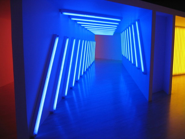
The artist model I chose to look at is Angus Muir. He creates large scale light sculptures that are interactive and are made to suit audiences of all ages. He has an Avondale based studio but works all over the world on sculptures and installations. The core belief he and his team have is to create something that is what it is. They believe that not every sculpture or installation has to have a bigger picture or idea. Their main idea is to just create pieces that people of all ages can interact and enjoy them without having to think about some underlying idea. Since Angus Muir creates light and color installations the majority of his works are shown at night so that they are able to give off their full effect and are turned off during the day in order to save power. He uses a range of materials from steel to computer graphic blocks. He chooses his materials on a case by case basis so that each installation is correctly designed for the specific space that it is going into, whether it is inside or outside. Most of his installation pieces are large scale so that people are able to see it from a distance are are excited to explore it. Since they are large scale it also allows more people to view it at once. Some of Angus Muir’s work have been on show at the Auckland Arts Festival and at the lights show in Smales Farm over the last couple years.

Surfaces and Texture

(I was unable to attend the first day of online classes due to work so I did all of the projects that were set alone instead of with my group). The images above were the four surfaces I picked out. I moved on to trying to make my own textures and surfaces using paper and the results are pictured below. I played with different kinds of creasing and layering as some of my pictures showed lines or dents to show that the surface wasn’t smooth but was instead textured.

I showed my textures to my group over a video call and got some good feedback on each piece. For my first texture they explained how even though the creases that have been made with the paper have been created by hand but they have a natural feel to them. The second one it has a layered effect to it as it had a gradient which goes from ripped and crumpled on one side to almost untouched on the other. We talked about the last one and how it allows natural movement (such as wind or small movements of the hand it is being held in) to the texture/surface and has a form of interaction to it. This idea of interaction links to my overall design as I am looking to create an interactive installment inside the space that involves the people who walk through. Overall this collaborative call allowed us to explain our textures and surfaces and let us take in positive feedback that I can now take forward when looking at how I want to build on my design ideas.

A capture of my group holding up a model each during our first call to give each other feedback.

I went on to make a couple more detailed surfaces that interested me. I took a few photos working with shadows and lighting in order to see them all at different angles. I then met up online with my group again to discuss our newest textures/surfaces and get some more feedback on them. The photos are shown below.

My next step is to Photoshop some of these textures/surfaces into a model of the site (St. James Theater) to see how they might look to people who walk through the space.

Surface in the space

This is a very basic rhino model of one of my ideas that I am looking at as I am currently undecided as to what exactly I want to do yet. It shows on the floor plan where I am looking to add my installation, along with a close up photo of the surface with the measurements that it will be with the space. There is also a perspective shot of how it might look to someone within the space walking around. I am still researching what color(s) it might be as I still want to do an interactive element within my installation piece. In the beginning I had trouble picking between two separate ideas that I thought would suit the space given and were influenced by the artist model I had picked out. Shown above is the basic rhino model of the first idea and pictured below is a basic rhino model of my second idea.

Both were ideas that I wanted to look into more before deciding on which to go with. I used Photoshop on each photo to introduce color and textures of the installment/intervention wall and these were then both shown to my peers within a group collaboration session to get some second opinions about which suited the space more. Below you will find both of the Photoshopped versions which I showed to my classmates.

After getting feedback from my peers and lecturers I decided to go forward and actually combine the two together to create a new design that takes the best parts of each of these original designs. The waves of the first design and the arched overall shape of the second were combined and is shown as one in the new design.

Shadows and Lighting

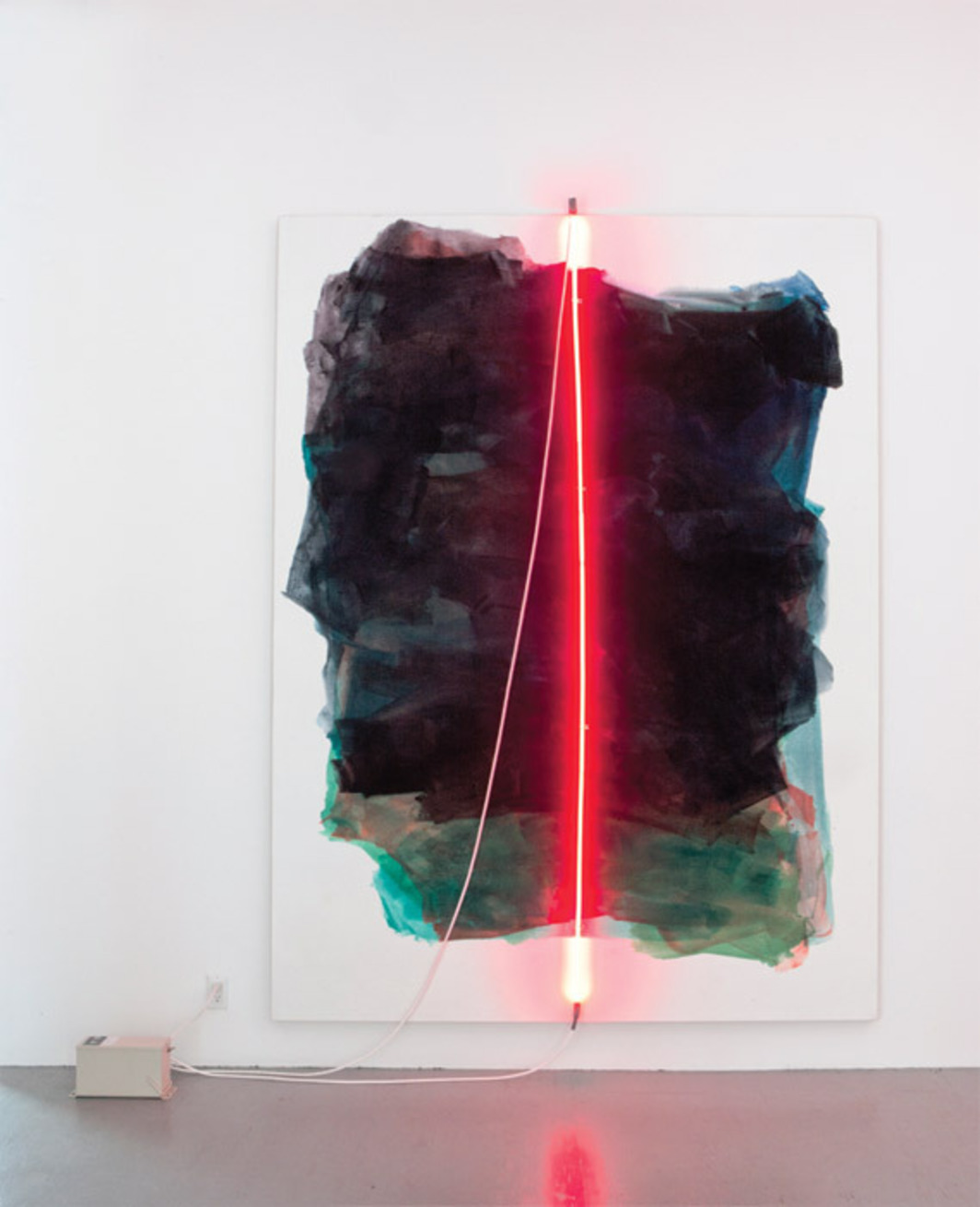
Due to the lighting within the space is being emitted from the LED lights on the installation wall, the space as a whole is a lot darker. I decided to do this as it would help to prepare the eyes of the public for the dark that will be in the theater space. I have tried to create an image through Photoshop in order to try and explain the lighting within the space which is pictured below.

Materials

The lighting within the space will be from the installation wall piece. The lighted sections will be shaped panels that run across the wall with wooden sections in between in order to break them up in order to stop them from being overwhelming for the small space. These light panels will be interactive for the public to be able to touch. When touched the panels will change colors which follow the hand (an example of what this would look like at a larger scale is shown below).

http://www.sensacell.com/lp/interactive-led/

Since all of the lights in the space are a range of different colors, I do not have a specific or refined color palette for the space. This allows the space to be bright and colorful at all times and makes the area more intriguing and fun for those who are experiencing it.

I believe that the hardest part about first introducing people to an interactive space is to have them understand that they are welcome to touch it. When entering a new space people are scared to touch the installments as we have been taught not to touch things that could be considered art. I think that if I can find a way to get someone to start touching and interacting with the piece then others will follow and start seeing the full idea of the installment piece. Once people get past this idea then they will be able to experience it as it was intended, as a fun interactive piece for people of all ages to enjoy and have fun with while they are in the space for whatever reason they are there.

Sections

Rendered Perspective Views

Audio Pitch Link

https://drive.google.com/drive/folders/1IN5Nvl2JG1Z0rS_qAcZ3BAlTcOIIEEYc

Fort Lane Design Project

Film Inspiration

After learning that the brief for this paper was based around cinema/movies I became excited about being able to design something the revolved around my favourite films. I have always loved psychological thrillers due to the build-up to create tension before the climax of the film where your whole perspective of what you have seen has changed. A feeling of mental gymnastics as you try and re-understand the film with the new knowledge you gain from the climax. This is what I want to look at during this project.

Some of my favourite films include

  • The perfection
  • Misery
  • Primal Fear
  • I’m thinking of ending it

Site

Fort Lane and the surrounding area

____________________

Cinematic devices & Site Visit

At the beginning of this project, my first goal was to plan and create a device that would make me look at the site in a different way and from a new perspective. I researched pre-cinematic devices such as shadow plays and became interested in the ideas of opacity and transparency. I ended up bringing two types of plastic to the site which had different opacity levels. While on the site I found the transparent sheet was able to reflect parts of other buildings in front of me and so I played around layering while at the site. The other plastic (A crumpled up plastic bag) created a blurred layer to the site and makes you look at the outlines and can’t see the details unless it is taken close up.

Above are images of the site during the day using the different layers of plastic, and also images I took at night to see the site at a different time. This allows me to see how the space changes from day to night and what stands out or shrinks away depending on the time.

____________________

Interests in the site

After visiting the site a handful of times I made some realizations about the parts of the site that I am most interested in. The thing that really stood out to me was the red neon strip that runs through the site. Working with my ideas of looking at opacity and transparency, light is a massive factor that links to those ideas and therefore I want to design something that is based on this neon light within the site.

Looking at the movies I have picked to focus my design around I have found that I am intrigued by the idea of mystery. Having something that is slowly revealed over time but isn’t fully understood until the end, or creating something that has two ways of perceiving it and a turning point in the middle so that your brain has to keep up to understand its new meaning as the space changes.

Quick Pitch

My design pitch for the Fort Lane site is based on the idea of layered perspectives, or the idea of something that can be seen in multiple different ways. I was intrigued by the idea of double narratives in some of my favourite psychological thriller movies where one perspective is seen by the audience but as the film continues there is a piece of information that is revealed and makes the audience see what they have already watched but from a new and different perspective.

The space which I plan to design will bring through the idea of a build-up and double perspectives within a single object that people can experience first hand. How exactly I am going to show these concepts and show my project will slowly be revealed in pieces, following the plan of the design itself…

5 Minute Models

From looking at the site I found a few main concepts that I was drawn to work with including:

  • Layering
  • 2 perspectives around the same object
  • Build up –  which was informed by the build-up of the movies that I enjoy.

Through these concepts, I created some basic models that showed them in a more physical sense. 

Artist Models

Dan Flavin

James Turrell

Mary Weatherford

Angus Muir

Anthony McCall

I became interested in the lights of Fort Lane and what they can do in terms of hiding and showing pieces of the site within the context of my design. So, I found some artist models that worked with light and the idea of what it brings forwards or sends back. All of these artists use light in their own interesting and specific way. Yet, they are all able to convey feelings and emotions within the space through their pieces. I want to try and find a way to convey a sense of discovery and feeling “strange” while walking through the site that I am designing.

My script worked with the same idea of double perspectives. What we miss and what becomes more obvious when our level of sight changes. 

Materials

I moved into looking at materials that would give me this feeling of a revelation at the end through creating a barrier between the two perspectives I wanted the audience to feel. One feeling would be that of being confined and following a path that is leading up to something unknown at the time. Pieces of the exterior world can be made out through colour and light but other than that you are in the dark about the exterior world that exists around you. The second perspective is from the outside looking at those who have no knowledge about what exists outside. Something you have experienced yourself but you have suddenly been enlightened as to what you were missing when inside and what they are missing now as you watch them. They have no idea what lies ahead, but you do, and soon they will be in your position, watching more who have no idea what’s ahead, and so the cycle continues.

First Design Visuals (Formative)

These images give a basic idea of what my design plans to look like but doesn’t give away everything that I have planned for the site. This way I can continue the build-up of my project linear to the way the movies I am interested in do.

Updated Design Idea

After having my formative assessment I found there were parts of my design that were more interesting than others. I got comments that my original tunnel type of idea didn’t seem interesting or new enough. So I took an idea that I was working with that related to the idea of hiding something in plain view and provoking curiosity within the city again.

My new idea is to take pieces of the Fort Lane site and make them look uninteresting at first glance. Only when looked at and explored closer do those populating the site find new and exciting pieces. I would like to stage it as a type of performance installation where some pieces of it stay the same throughout the whole timeframe, some change slowly over time, and some happen suddenly only a handful of times. This way there is always something new and different about the space and will continue to create curiosity in those walking through the site even if they have seen a version of it before it will not be exactly the same.

Updated Site Map

The red dots are where I am proposing to have pieces that fit into my unassuming ideas. I am also thinking about adding a new red LED light strip (relating back to the one currently above the lane). This is the line you can see on the map and will send dart across above the lane, lightly suggesting where the hidden elements can be found.

Rhino Model

These are pieces of my Rhino Model of Fort Lane that I created to position and test my hidden Facades. These include fake doors, hidden entrances to buildings, doors that take you nowhere, one-sided glass, and covered up windows to hide the space from the outside roads and pathways.

Starting Perspectives

Floor Plan

New Project Abstract

Elevations

Scale 1:500 (On A3)

Detailed Pages of Interior Pieces

The images shown below are line details of the pieces and interventions I added to the site. The aim of these pages is to give a clearer idea of what these do, what they hide, or what they could maybe be used for.

Feedback from the Co-Design Workshop

For the Co-Design Workshop, I had Caitlin Hogan as the critic for our group. All of us got great amounts of detailed feedback to help us improve our designs and craft our ideas to make them clearer before the final presentation. Some of the feedback I got included:

1.”Newspaper – what is on the newspaper? Could this have some hidden invitation about what is in the space? Could the newspaper have articles about what is behind the space etc..? Could this have instructions on all the hidden elements of the space?”

I would want to have subtle writing throughout the newspaper which continues the gesture of invitation. With titles such as “Come on in, the Lane is fine”, or “City regulars discover new space within previously empty lane”. It would add to the idea that only those who take the time to look closely will figure out all of these hidden easter eggs which relate to the site hidden just behind it.

2. “How can you show a suggestion of invitation? Is this through handles or things that you want to touch and feel which then triggers the opening or unveiling of spaces? What do people naturally want to touch and feel which then might open this up?”

I went through and began adding subtle handles and prints which continue to shows these gestures of invitation. I wanted them to be small so that they would be functional but not completely attention-grabbing. I still wanted people to find these interventions without them being given away by their handles or opening mechanisms.

3. “There is definitely an opportunity to explore displaying models through photography and even though it is a digital submission I don’t think that needs to be missed if it is important to your project.”

During my feedback session, I mentioned that during lockdown I missed the physical modelling aspect to designing spaces as I see that as a strong skill set of mine. We discussed how the opportunity is still there but with the current lockdown restrictions, it is very hard to access the materials that I need along with not having an area where I could do these models within the space I am in. Sadly it seems like I will have to miss out on the physical modelling aspect for this project but only due to the restrictions that lockdown has placed on me.

Perspectives

Entrance Facades covered in newspaper
Detail shows what is behind each of the doors
The detail that invites those to push the door
The Perspective looking down the Lane #1
The perspective of looking down the Lane #2

Feedback after the Final Presentation

The final presentation of my work was both relieving and terrifying. Knowing that this could be my last university project ever I wanted to show my work off as best as I could to show how far I’ve come since 1st year. I got some incredible feedback from the panel of critics which allowed me to then work on and make my project just that little bit better before handing it in. The main thing that they focused on was that I needed to look into rearranging my pages to make the presentation flow a little bit better. My pages at that time weren’t polished yet and so they needed some reworking to make them look stunning. I also got a comment on how they really liked my small gestures of invitation but thought that I could push this idea a little further next time which is defiantly understandable.

Self Reflection

Looking back at this project I am very proud of the final work I was able to produce under such a strange semester arrangement as covid forced us online halfway through. From changing my idea halfway through to the finished project and adding all the little details, I found this paper super exciting and a great way to round off the year.

If I was to do this project again I would like to change a few details. I would add in renders of how the spaces looked on the other side and what may have been behind the doors or windows. I ran out of time to do these renders as they each take hours to render and photoshop. I wanted all of my final renders to be well done and not half completed as I would not have felt comfortable handing in work that I wasn’t completely proud of. I also would have liked to look into how I could make small suggestions about this space throughout the city. Whether it was through small flyers or stickers placed around that hinted at the placement of this secret space to draw slightly more attention to it from those who look closely enough to find these extra invitations to the space.

Auckland Winter Gardens

History of the Auckland Winter Gardens

William Henry Gummer

The Auckland Winter Gardens were built between 1916-1928, and was renovated multiple times during 1945, 1954, and 1993-1994. William Henry Gummer and Charles Reginald Ford were the architects for the Auckland Winter Gardens and it was designed in the style of Arts and Crafts architecture. This was a movement created by William Morris and was made well known by Gertrude Jekyll and Edwin Lutyens through their years of working with this era/phase of architecture.

The Arts and Crafts style looks at/revolves around the idea of moving away from machine-made items and to go back to handmade craftsmanship of goods within and around the home. This movement was popular throughout the 1880’s to the 1920’s. “The core characteristics of the Arts and Crafts movement are a belief in craftsmanship which stresses the inherent beauty of the material, the importance of nature as inspiration, and the value of simplicity, utility, and beauty”

The site is considered Heritage New Zealand Category 1. According to Heritage New ZealandCategory 1 historic places are of special or outstanding historical or cultural significance or value.” This means that I cannot demolish any of the site that already exists. Instead I must look at ways to add to the site while keeping in mind the aesthetic, functionality, and values that preexist within the space thus to make my design cohesive with the other buildings and have the area flow as one.

Flower and Plant Research

The flowers within the Auckland Winter Gardens are from all over the world, they create a taste of the world’s flowers and plants within a single space. The heated tropical house (which sits at around 28 degrees Celsius) allows for plants and flowers to thrive that would otherwise not be able to survive in the New Zealand climate.

The Corpse flower (Amorphophallus titanum) is one of the most popular flowers for visitors to see in the Winter Gardens. It is one of the rarest in the collection and blooms once every 2-3 years, so when it does, thousands flock to see it flower even though it smells like a rotting corpse (hence the name).

Another crowd favorite is the Mimosa Pudica also known at the Shame plant which has leaves that close up when touched (similar to how a Venus fly trap closes). It has light purple flowers which look like little fireworks going off around the plant, making it a fun and interesting plant for those to look at and touch.

Some on New Zealand’s native flowers and plants are kept in the unheated house for visitors to enjoy along with more exotic plants that are able to survive in the New Zealand climate. I have never been to the Auckland Winter Gardens so I am unsure of the exact plants they hold or if they change them around depending on the seasons, but I am planning to go when it is possible to in order to gather more research on what plants they hold within.

Social Contexts of The Site

Sectioning of the City

The Winter Gardens are surrounded by the Auckland Domain, one of a handful of open green areas within the heart of Auckland city. This domain helps to show the sectioning of the city in terms of its layout as the surrounding areas are full of apartments, houses, and businesses, constricting the growth of the natural area. This is interesting to look at as we are trying to physically confine nature to fit with our city. I relate this to the work of John Dixon Hunt who categorizes nature into 3 sections:

  1. The wilderness which is untouched by man
  2. Urban and agricultural developments
  3. Aesthetically appealing gardens/parks

The Auckland Winter Gardens would fall under category 3 as it has been designed to showcase the exotic plants in the most appealing way possible in order to draw in the public.

Attraction to the Site

The attraction to the site is aimed for both tourists and locals like as it shows off plant specimens from around the world along with an array of native plants. This allows everyone to learn about the plants and flowers that they are interested in looking at and finding out more about them. Another reason why this site tends to attract people is the fact that it is situated right next to the Auckland War Museum (about a 5–10-minute walk). Due to their proximity to each other they allow the public to walk between them with ease in order to create a full day of activities with minimal travel to various places.

Inclusion/Exclusion

The Auckland Winter Gardens has a layout which allows comfort for as many people as possible. The site has an entry which is assessable by those who have disabilities, therefore helping as many people as possible to enjoy the exotic flowers and plants. I am unsure currently if they offer guides around the gardens and if so if they have different language options available for those who don’t speak English. This is something that I will be looking into on the future.

Educational Space

I have decided to design an educational space within the site of the Auckland Winter Gardens that would allow kids to witness and learn about nature and the environment in a hands-on way that links to the gardens that surround them. I made this decision as I work with kids and they love telling me about how their school days went when they come into the store and they are always excited after a school trip somewhere to learn outside of a regular classroom.

An educational space within the site would be targeted at but not limited too primary school children, aged around 5-12. They would be taught about things such as:

  • The importance of the environment
  • How to be environmentally friendly
  • Climate change
  • How to plant their own garden
  • Ecosystems

They would be taught through interactive means such as walking through the Auckland Winter Gardens, and by hands on learning with plants such as possibly a small vegetable garden within the area where they can plant and pick vegetables to understand the lifecycle of a plant or where their food comes from etc.

I believe it is important to teach these things to kids at a young age in a way that gets them excited about the world around them and how to take proper care of it. My end goal for this space would be that children proactively have conversations with each other and family, and look at planting their own produce at home. This could be the beginning of helping individuals offset their carbon footprints and make NZ cleaner and greener as a whole.

Educational Space Reasoning and Research

While deciding on the space that I wanted to design and create for the Auckland Winter Gardens site I was researching different topics related to the site that could be taught to children. The main topics that I came up with were:

  • Climate change
  • How to grow your own food
  • Gardening
  • Ecosystems
  • Plant and Insect life cycles
  • Environments and how to be Environmentally friendly

These would all be great for children within the age range between 5-12 years old as these are basic and exciting topics that can learnt with a hands on approach in a related environment. Something that I did look into was the idea of looking into teaching older groups (between 12-16) about healthy eating and living habits. This could cover topics such as:

  • Exercise
  • Healthy food/diet ideas
  • The problems of unhealthy habits
  • Obesity

After doing some research through the NZ Ministry of Health website I discovered that 1 in 3 New Zealanders aged over 15 are classified as obese (30.9%). This is a statistic that NZ should not be proud of. Over the last 2 years Covid-19 has financially impacted many NZ families and this project would offer many young people the opportunity to try different fruits and vegetables that they may not have had before and would also incite them to buy seeds or small plants that they can grow at home. The hopes in this would be that overall our obesity levels would drop and that young New Zealanders would be given the opportunity to experience things that they may not have been able to currently.

The project would also have a pass along affect with the education provided being passed on to family and friends and would open up families, who had not considered horticulture before, to give growing produce a go and be a fun bonding experience for all.

Reflection

I need to look at more ways to link my site to what I want to add to it. One of the girls in my group liked how I was looking at the project from the view of the kids who would be using the space rather than what I would like to see in the space. I do need to look at extra ways to get the kids involved – interactive learning ideas to be added inside the classroom rather than just outside with the planter gardens. Think about what the pulls are to the site – link them to the senses context.

Week 5 Pin Up

The feedback I got this week was to find a way to try and link the site of the Auckland Winter Gardens in a stronger way to my addition that I want to create. After discussing with the lecturers and classmates I started to think about the idea of a tour around the gardens that would include fruit trees or bushes within the winter gardens themselves. This way I would be able to link my idea of the planter box and getting kids to be hands-on when learning about food and how it grows to the wider site that surrounds my introduced piece. It was suggested that I look at lining the research that I did on senses to a visual map of where they are scattered within the site. This way I can pin point where the important places within the site are so that I can focus on them if I decided to go on this idea of a tour or guided session through the garden as part of my addition to the site.

Week 6 Pin Up

After week 6 pin up I got some feedback that my links still need to be a little stronger to the complete site of the Auckland Winter Gardens. The original change in ideas to do a tour of some type seemed interesting but still not as connected as it could be to the wider site. I talked to the lecturers about this and it was suggested to look into what I could do to get the kids excited to go to the site and do something that helps the gardens function at the same time. My original idea was to have the kids grow vegetables and herbs in the planter boxes but this also didn’t strongly relate to the site as a whole as seemed to be an individual and disconnected area. The idea of talking to the gardeners at the Winter Gardens was suggested so that I could get their insight into what they would do if this was a brief given to them. Due to this I have decided that my next move is to go and talk to these gardeners in order to find a way to merge my existing ideas along with these new ones to create a more rounded and understandable project.

Basic Model

Self Review

After looking through these self review sheets on what I need to be able to show by hand in I have realized a few areas which I need to work on. I need to show a larger amount of iterations of my design as I usually filter through my ideas to find the best ones and this can lead to me not showing enough range of my work and process. I also need to work on exploring and expanding my ideas rather than getting stuck on a design that I think is final. This will allow me to look at other options which may work better than what I previously though of. Exploration of materials and ways of construction is another thing I need to work on as they seem to come as one of the last thoughts to me since I tend to overthink my design until it is correct in my eyes which can take a lot longer than it should do, leaving me with little time to look through and choose the best materials for the space.

Auckland Winter Garden Nursery

I was able to talk to one of the gardeners at the Auckland Winter Gardens about the process of growing the plants for the two glasshouses. I was told that nearby they have a nursery where they plant and grow the seeds/saplings until they are ready to be added to either the tropical or cool house of the Winter Gardens.

Talk with the gardener

After finding out about this I asked the gardener if it would be possible for some of the plants to grow outside of the glasshouses that make up the nursery. He said that a few of the plants in the cool house only really need the nursery glasshouse for protection from birds that like to eat the seeds and the flowers that grow. I gave him a quick pitch of my idea and the brief for this paper and he seemed interested in it. He told me that the idea of getting the ids to plant some of the seeds for the cool house in a separate area could be a viable possibility as long as they got enough sun and were protected from the birds. Then once they have grown for a bit they could be moved to the nursery until ready to go into the Winter Gardens or be moved straight from where they were planted into the Winter Gardens (Depending on the plant).

My next step is to redesign the planter boxes so that they can be suitable for the plants which ultimately could end up in the Winter Gardens. This would mean that my link from my educational space to the site is strong as the kids are immediately helping the gardeners grow what they need, and they learn about the environment and why it is so important to look after it (including the growing of plants).

Critique Day Feedback

After having my work critiqued in week 7 I was told that I have set up a good initial response to the brief given to me and that my current work has the potential to be developed in detail into an interesting proposition. I was told that I needed to work on refining what is needed for the particular educational facility and how it works between the nursery and the Winter Gardens.

After receiving this feedback I think my next steps are to research further into if my educational space would work better situated closer to the Auckland Winter Gardens glasshouses or the nursey. Both places can work for different reasons but more research needs to be done in order to make the best decision for the project. I also need to start working on my A2 elevations and floor plans for the space I have designed as this will give all the information I have and put it into perspective through the use of scale (most likely 1:50). I would also like to add some more context of the site to my board as I lacked photographic evidence of the Winter Gardens site. This is because I feel as though adding photos of the site that I am looking at designing into would help those who are new to my project understand it easily.

Changes to the space

After chatting with my lecturers I decided to redesign my space slightly in order to make it more dynamic and interesting. I made to space more geometric rather than rounded. I was able to start designing the interior of this space soon after to create a learning environment that was new, exciting and fun for the children who enter the site. A new model has been made and photos will be uploaded soon along with sketches of my plans for the interior.

Positioning Statement

The Auckland Winter Gardens is a place which shows off the most exciting flora that New Zealand and the rest of the world have to offer. It gives us an opportunity to find out more about the plants that we see everyday and ones we may never get to see outside of this space. Inside of the glasshouses we experience the plants when they are in bloom and in the peak of their life cycle. What most people don’t know though is that just a short walk away is the nursery where all of these plants are raised to become beautiful flora we can gaze upon within the glasshouses.  

One thing that I thought the space was missing though was an area to get kids interested and excited to learn about everything the site has to offer plus more. This is why I propose to create an educational space within the nursery which links to the Auckland Winter Gardens. This space will allow children to learn and understand different ideas related to plants and the environment through a mixture of learning techniques. It shall be a place where they can get excited through interactive and experience based ways of learning.

The children will be able to help the nearby site as they would be planting seeds of native flora, which eventually will end up on display within one of the Auckland Winter Gardens glasshouses. Within the designed space they will also be able to receive talks from guest speakers or teachers about a range of fitting subjects from how to plant a vegetable garden at home to why we need to look after the environment to stop climate change. 

Context Photos

Senses Map

I drew up a senses map in order to see where each sense was used most in each part of the site. In the first image I have mapped out each sense individually to see where I could experience them within the space and took down quick notes of what was causing them. The second image is one where all of the senses are then overlaid to show all of them at once so that it you can see where the senses are most stimulated at any given point.

Final Placement of the Space

The placement of my educational space is next to the nursery (about 100 meters away from the Auckland Winter Gardens). I chose this spot as it links to my idea of showing the kids how plants grow over time. It also links to the growth of the kids themselves as they start off small and then grow until they are big enough and ready to move onto the next thing. This is just like how the seeds that are planted in the nursery (and in my new educational space) will eventually end up on show within the Auckland Winter Gardens site.

Models

I made 2 different models to show off my design for the site. The first image shows a 1:50 scale of the full educational space where the roof can be removed in order to look inside and understand the space. The second image is a 1:20 scale model of one of the interior walls which holds seating that can be removed and inserted easily.

Colour Palette

The colour palette I created is from a selection of colours found throughout the context photos that were taken within the Auckland Winter Gardens site. A mixture of whites, greens, yellows, reds, and browns. All of these colours can be seen in different features of the site from the leaves to the bricks to the glass windows.

What is in the space?

There are sets of fixed tables and seating where the kids are able to sit down and use for work. Whether it’s drawing, writing, creating or just discussing with each other, these tables are great for group work or focus work that requires a hard surface.

I added some seating that can be removed and inserted into the walls depending on how much floor space is needed at any given time. The seats are lightweight and low enough on the walls so that the kids are easily able to move them around by themselves. They come in a few different sizes and colours in order to add another element of fun to space.

The planter boxes located just outside of the space are there to allow the kids to be interactive with nature and plant seeds themselves. This is in hopes that they learn how to do it and bring home that knowledge to them continue with their families. Hands-on learning lets the kids have fun with the process of planting and being educated about the environment rather than having to sit and take notes which doesn’t stimulate them enough to want to continue doing it and try it at home.

Plants Research

There are a handful of native New Zealand plants which could be planted in the planter boxes by the children within the educational space. The seeds can be planted and then moved into the nursery if more time or growing space is needed before moving into the Auckland Winter Garden Space. The different plants grow to different heights so they can create a layered canopy when all of them are eventually inserted into the Auckland Winter Gardens and will be able to show off some of New Zealand’s most stunning native plants. Some of the plants that I think would work best in the space are:

  • Flax
  • Astelia
  • Nikau Palms
  • Coprosma
  • Kowhai
  • New Zealand Iris
  • Hebe
  • Puka
  • Poor Knights Lily

I believe these would be the best selection for the kids to plant as they are easy to take care of and since the planter boxes are or a medium size, they will not be able to become too over grown before being moved to their next growing placement (either within the nursery or in the Auckland Winter Gardens itself).

A2 Floor Plan and Sections

1:50 Scale

Materials

For majority of the materials that I chose for my educational space, my reasoning for choosing them were based off of the materials from the original site of the Auckland Winter Gardens (AWG).

Brick – There is a brick exterior wall on the building which can also be found in the AWG site as the glass houses and surrounding walkways are constructed out of laid bricks.

Wood – I chose to use wooden flooring in the space as it is easy to clean (a good thing to be thoughtful about as the kids will most likely be tracing dirt into the space from outside). Over head the wooden beams allow for things to be hung from them in order to help display pieces that the kids have made within the space.